Cool QR Code Designs That Still Scan
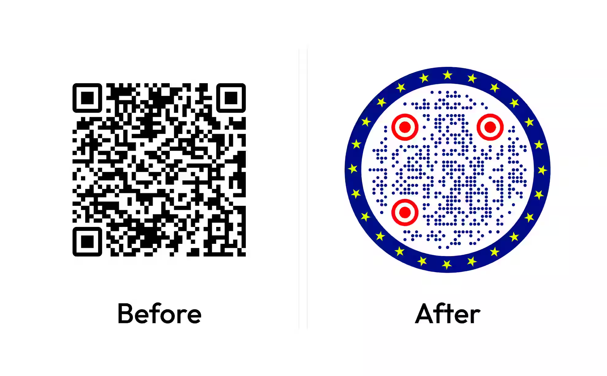
A plain black-and-white square works, but it rarely fits a brand. Here are creative ways to design a QR code - colors, custom shapes, logos, and circular frames - along with the limits that keep every version scannable.
Generate QR CodeEighteen QR Code Designs, and Why Each One Scans
Every code below is drawn rather than photographed, so each one is a working symbol instead of a picture of one - point a phone at any of them. Under each design: the pattern and eye setting that made it, its two colors, and the measured contrast between them.
Plain Ink on White
A near-black code on white is the reference every other design here departs from. Pure black would measure 21:1; softening the ink costs a camera nothing and prints less harshly on coated stock.
- Pattern
- Square
- Eyes
- Square
- Colors
- #111110#FFFFFF
- Contrast ratio
- 18.89:1
Midnight Dots on Cream
Round modules on a warm cream ground read as designed rather than default. A dot spans 80% of its module's width, so a dotted code leans harder on contrast than a square one - cream is light enough to carry it.
- Pattern
- Dots
- Eyes
- Circle
- Colors
- #10243F#F5F1E8
- Contrast ratio
- 13.84:1
Forest Vertical Pills
Vertical pills merge each run of modules into one capsule, which prints cleaner at small sizes than the same code drawn as separate dots. The timing rows stay dotted, because an alternating run is never longer than one module.
- Pattern
- Vertical pills
- Eyes
- Rounded
- Colors
- #1E3A2B#F2F5F0
- Contrast ratio
- 11.26:1
Terracotta Diamonds
Rotated squares suit earthy, craft-led packaging. Terracotta on off-white is the lowest-contrast pair in this gallery - just past the 7:1 a print job wants, and a useful marker for how dark a warm mid-tone has to be.
- Pattern
- Diamonds
- Eyes
- Rounded
- Colors
- #7A3B21#FBF3EC
- Contrast ratio
- 7.73:1
Slate Horizontal Bars
Horizontal bars are pills with the corners left sharp: runs of modules merge, edges stay square. Fewer, larger shapes survive small print better than the same data drawn as isolated dots.
- Pattern
- Horizontal bars
- Eyes
- Square
- Colors
- #2F3E46#FFFFFF
- Contrast ratio
- 11.06:1
Plum Two-Size Dots
Two-size dots vary the radius module by module, which gives a code texture without moving anything. A scanner samples the center of each module, so the smaller dots cost nothing as long as they stay centered.
- Pattern
- Two-size dots
- Eyes
- Circle
- Colors
- #3B1F47#F7F2F7
- Contrast ratio
- 12.90:1
Mono Small Squares
Small squares leave a deliberate gap between modules, which is also the room absorbent stock needs when ink spreads. The printed module is 74% of its cell, so this pattern wants a larger code, not a smaller one.
- Pattern
- Small squares
- Eyes
- Square
- Colors
- #1A1A1A#F0EFEB
- Contrast ratio
- 15.13:1
Ocean Stars
Stars are the most decorative pattern the generator draws and the most demanding: a star covers less of its cell than a dot, so the code wants to be larger and the contrast higher. Deep blue on white gives it both.
- Pattern
- Stars
- Eyes
- Circle
- Colors
- #0F3D5C#FFFFFF
- Contrast ratio
- 11.40:1
Sunrise Triangles
Triangles point every module the same way, which reads as movement on a poster. The triangle's center of area sits exactly where a scanner samples, so the grid survives the change of shape.
- Pattern
- Triangles
- Eyes
- Rounded
- Colors
- #5C2E00#FFF6E5
- Contrast ratio
- 10.60:1
Cream on Near-Black
Light modules on a dark ground is the one inversion that still fails in the wild: plenty of scanning apps assume dark-on-light. The iPhone and Android cameras handle it, so keep inverted codes for screens and audiences you know.
- Pattern
- Dots
- Eyes
- Circle
- Colors
- #F2EFE6#14161A
- Contrast ratio
- 15.75:1
Berry Horizontal Pills
Horizontal pills in a deep berry suit invitations and stationery, where a code sits beside a serif and should not shout. The capsule ends round toward the background, so leave the quiet zone at its full four modules.
- Pattern
- Horizontal pills
- Eyes
- Rounded
- Colors
- #6B1839#FDF4F7
- Contrast ratio
- 10.72:1
Graphite Vertical Bars
Vertical bars give a code a woven, textile look and hold their edge on coated stock better than isolated dots. Graphite on a barely-warm white clears the print target without going to pure black.
- Pattern
- Vertical bars
- Eyes
- Square
- Colors
- #23262B#F4F4F2
- Contrast ratio
- 13.78:1
Charcoal Code, Amber Eyes
Giving the three finder patterns their own color is the cheapest way to make a code look designed. The eye color is measured separately from the pattern: this amber clears the 3:1 floor and the 4:1 screen target, but not the 7:1 that print wants.
- Pattern
- Square
- Eyes
- Rounded
- Colors
- #2B2B2B#FFFFFF
- Contrast ratio
- 14.16:1
- Eye contrast
- 5.18:1
Sage Small Squares
Sage on a pale ground is a low-chroma pair that still clears the print target comfortably. Colour and contrast are separate decisions - a muted palette does not have to mean a marginal code.
- Pattern
- Small squares
- Eyes
- Rounded
- Colors
- #33422F#EDF0E6
- Contrast ratio
- 9.28:1
Cobalt on Warm White
A saturated blue is the safest bright color for a QR code, because blue contributes least to the luminance a camera measures. The same saturation in yellow or green would not clear the floor.
- Pattern
- Dots
- Eyes
- Square
- Colors
- #1D3FA8#FFF9F0
- Contrast ratio
- 8.61:1
Charcoal Stars on Oatmeal
Stars on oatmeal read as seasonal without a single seasonal graphic. A decorative pattern asks for the largest print size on the page: size the code by its module, not by the finished square.
- Pattern
- Stars
- Eyes
- Rounded
- Colors
- #26231F#EFE7D9
- Contrast ratio
- 12.74:1
Crimson Triangles
Crimson is dark enough to act as a pattern color, which most brand reds are not. Measure the red you actually have rather than assuming: a mid red on white typically lands near 4:1, under what print needs.
- Pattern
- Triangles
- Eyes
- Circle
- Colors
- #7F1020#FFFFFF
- Contrast ratio
- 10.51:1
Deep Teal Pills
Deep teal is a near-black that carries a hue, which is how a code reads as colored and still measures like ink. Vertical pills give the surface a texture without moving a single module off the grid.
- Pattern
- Vertical pills
- Eyes
- Circle
- Colors
- #0B3B3C#F0F7F6
- Contrast ratio
- 11.34:1
What Makes a QR Code Design Work
A creative QR code is a standard QR code styled with intentional design choices - custom colors, module shapes, a centered logo, or a rounded frame - while keeping the contrast and structure a scanner needs. The creativity lives in the presentation, not the data underneath. Of those choices, shape is the one with a measurable cost in width, mapped in QR code shapes.
Where the Design Freedom Lives
A QR code has fixed parts, but most of them tolerate styling. Knowing which elements you can push and which to leave alone is what separates a creative code from a broken one.
- Module Shape - the dots that carry data can be rounded, dotted, or joined into smooth connected paths.
- Color and Background - foreground and background can match your palette, as long as they stay clearly distinct.
- Finder Patterns - the three corner squares can be recolored or gently rounded, but heavy restyling risks scan failures.
The center of the code is the one place you can safely cover: raising the error correction level reserves enough redundancy to sit a logo in the middle without losing data.
What Makes a QR Code Look Cool (and Not Just Loud)
A cool QR code is one people notice and can still scan. The difference between an eye-catching design and a loud one is restraint: pick one idea - a color, a shape, a logo - and let it carry the code. Every choice still trades against readability, so low contrast, a missing quiet zone, or over-styled corners will stop a code from scanning no matter how good it looks. The goal is a design that survives a quick scan in real lighting, not just one that looks striking on screen.
Generate QR Code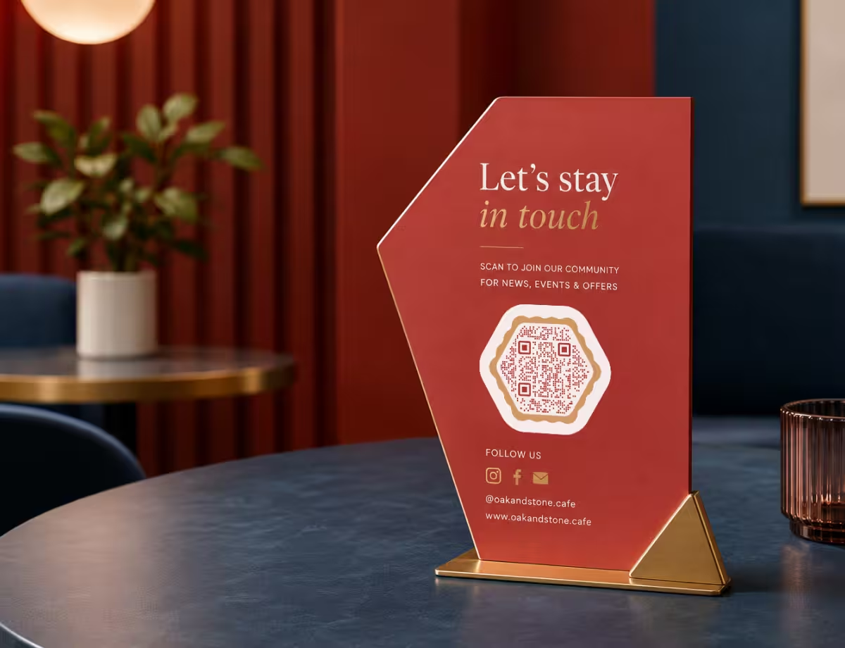
Cool QR Code Design Ideas to Borrow
Five approaches that consistently look intentional and stay reliable. Mix them to fit the context rather than stacking every effect at once.
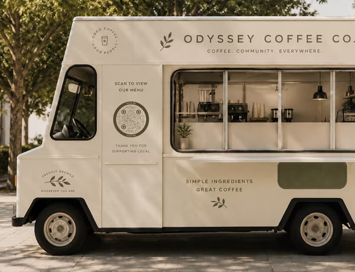
Brand-Colored Codes
Swap black for a dark brand color on a light background. It ties the code to your identity while keeping the contrast scanners rely on.
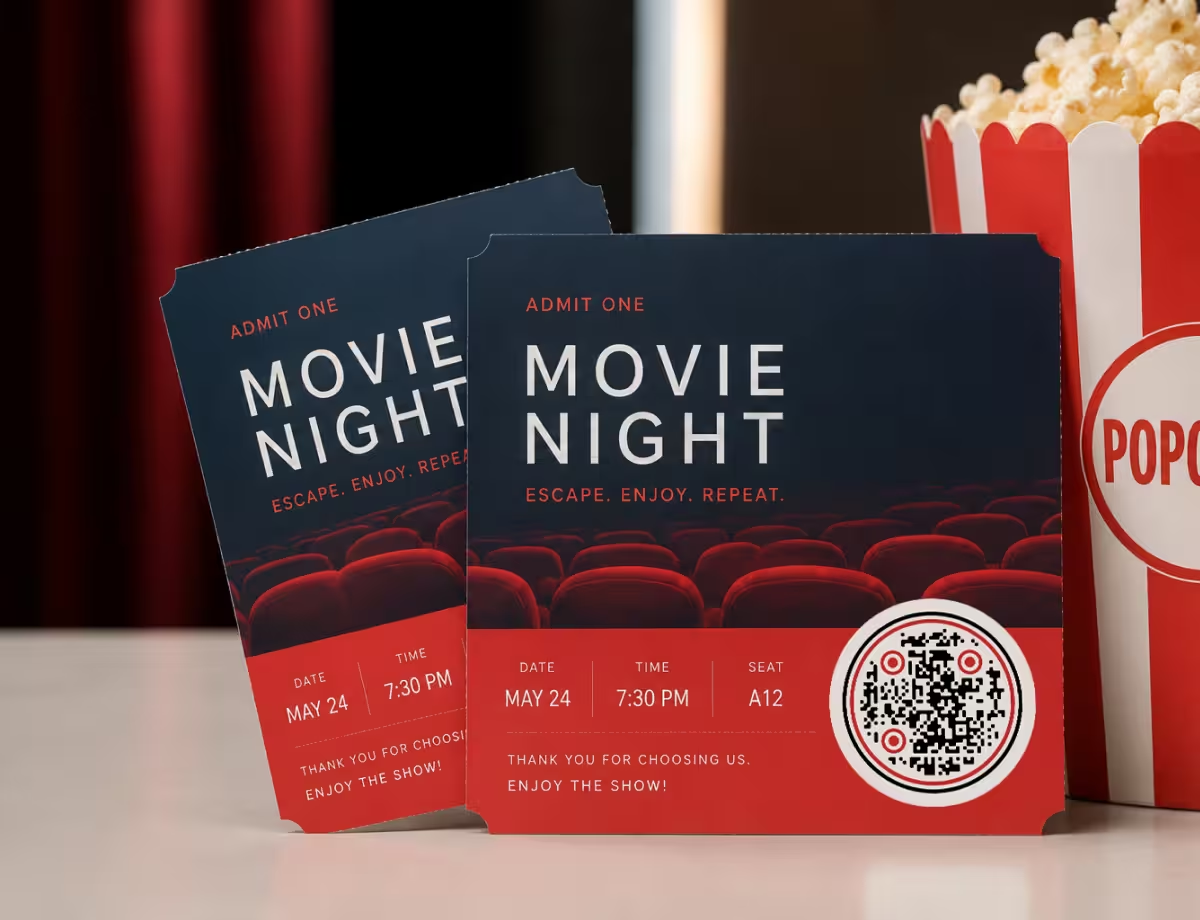
Circular QR Codes
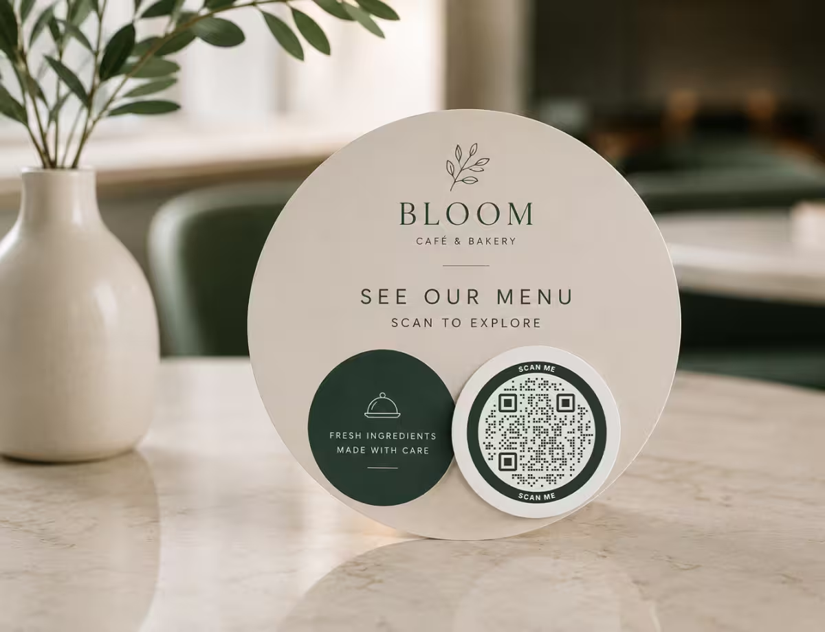
A round frame with dotted modules reads as designed rather than default - a strong fit for coasters, stickers, packaging, and profile-style layouts.
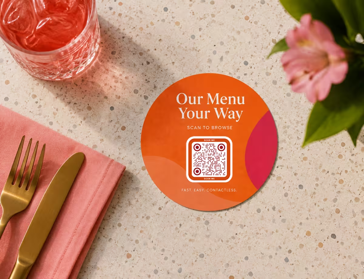
Centered Logo
Place a small logo in the middle over a higher error correction level. It signals trust and makes the code unmistakably yours.
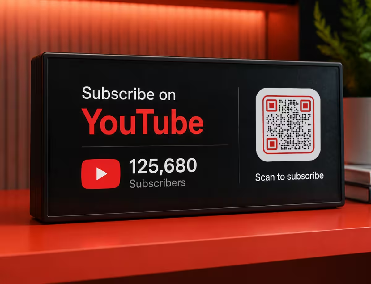
Themed for the Occasion
Match colors and shape to the moment - soft tones for a wedding, bold contrast for an event poster, muted neutrals for a menu.
Print and Packaging Art
Set the code inside a framed label or badge with a short call to action. Vector export keeps edges crisp at any print size.
Design Tips That Keep Creative Codes Scannable
Creativity and reliability aren't opposites, but a few rules keep them on the same side.
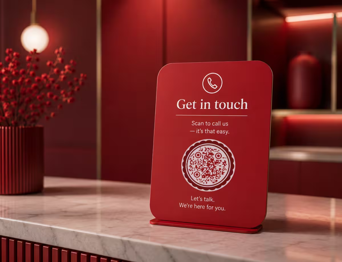
Keep the Structure a Scanner Needs
Styling is safe right up until it erodes the parts a camera locks onto. These are the ones to guard.
- Protect the Contrast - keep a clearly dark pattern on a clearly light background. Light-on-dark can work, but pale or low-contrast pairings are the most common reason a stylish code won't scan.
- Leave the Quiet Zone - the empty margin around a code helps scanners find it. Crowding artwork right up to the edges is an easy way to break an otherwise good design.
- Respect the Finder Patterns - the three corner squares are how a camera locks on. Recolor or lightly round them, but don't remove, crop, or heavily reshape them.
- Raise Error Correction for Logos - a higher error correction level adds redundancy, so a centered logo covers spare data instead of essential data.
- Be Careful With Gradients and Backgrounds - gradients that fade toward the background, or busy photos behind the code, quietly erode contrast. Keep the pattern itself solid and clear.
Design for the Real World, Not Just the Screen
A creative code has to survive being printed, scaled, and scanned in ordinary light. These habits get it there.
- Test on More Than One Phone - cameras and scanning apps vary. Check the code on a couple of devices and, ideally, on the final printed material before it ships.
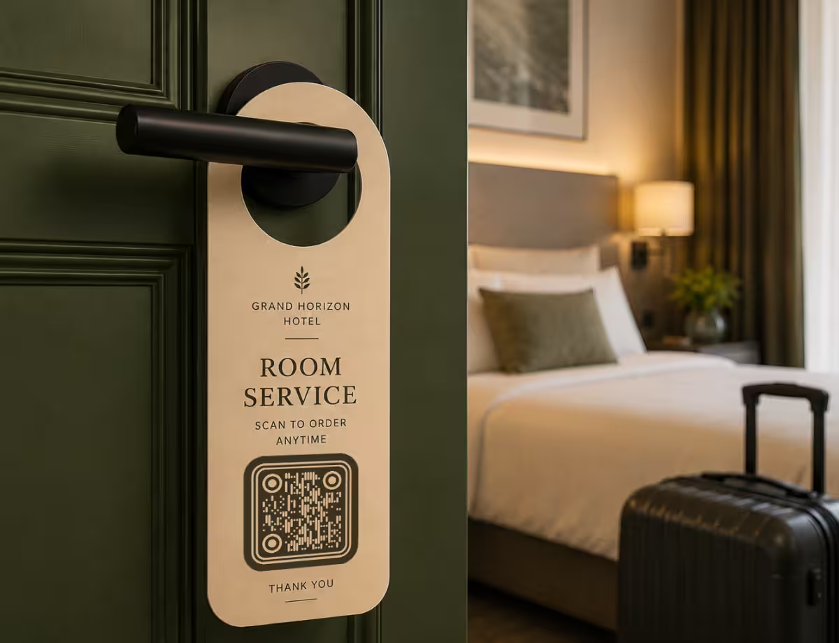
- Match the Design to the Context - a playful code suits a party invite; a restrained one suits packaging or a menu. Let the setting set the tone.
- Size It for the Scan Distance - a code scanned from across a room needs to be much larger than one on a business card. Bigger, simpler codes scan faster.
- Keep the Data Short - long links create dense codes that leave little room for style. A short or shortened URL keeps the pattern open and easier to design around.
- Export Vectors for Print - SVG keeps every module sharp at any size, which matters far more on paper than on screen.
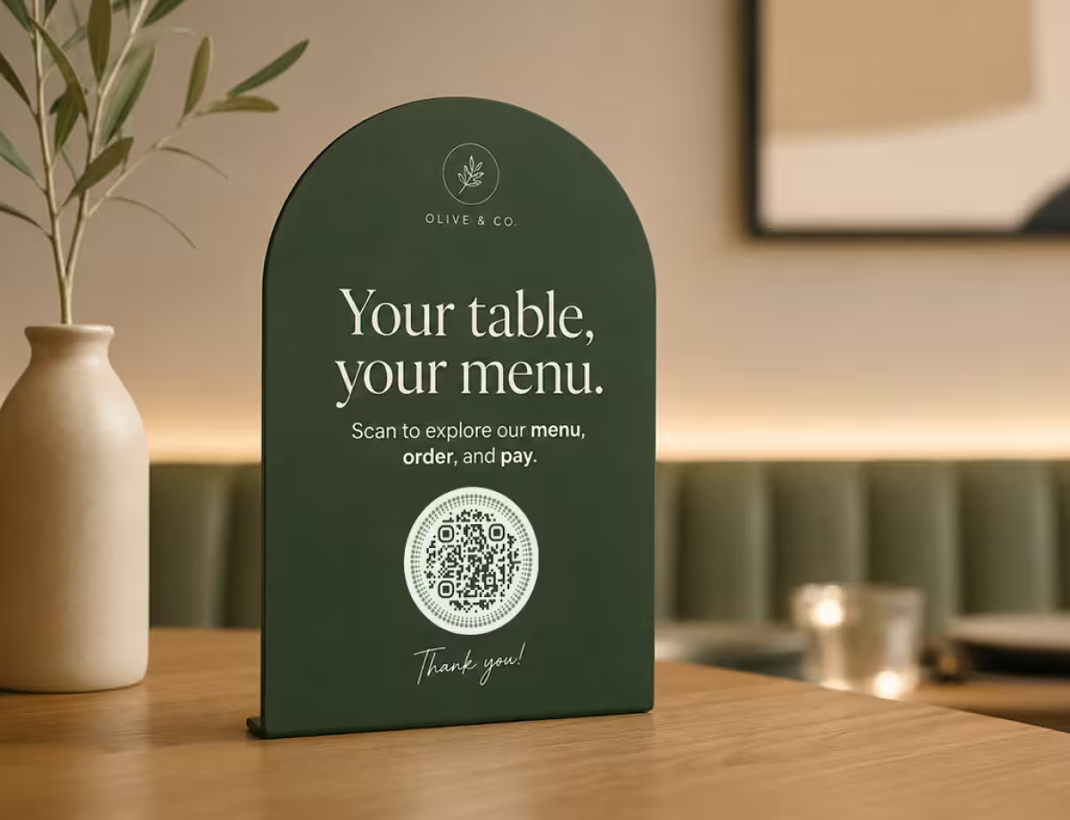
Unique QR Code Designs in the Wild
Seeing the idea applied to real projects makes it easier to plan your own.
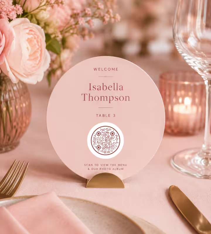
Wedding and Celebration Invites
A soft-toned circular code styled like a seal links guests to an RSVP page or registry. Matched to the invitation's palette, it reads as part of the stationery rather than an add-on.
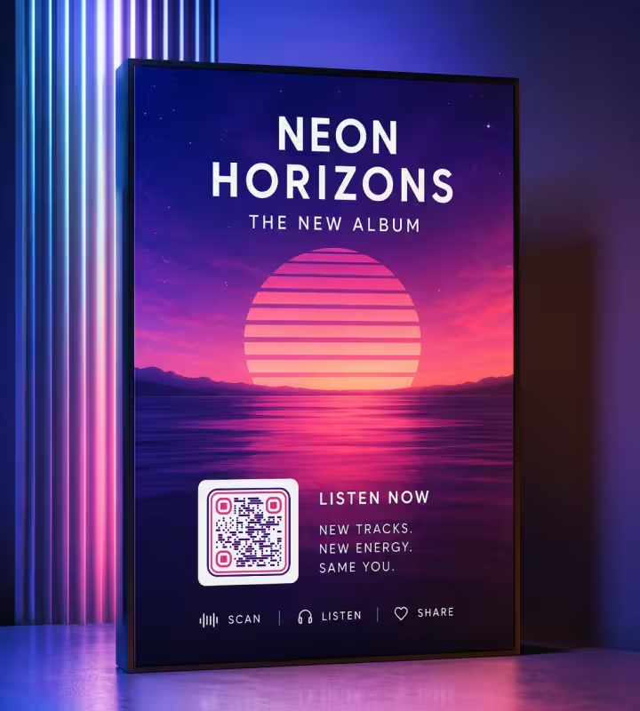
Music and Album Promo
Bold contrast and a framed layout let a code sit on cover art or a poster. It sends fans straight to a release, playlist, or tour dates without breaking the design.

Boutique Product Packaging
Dotted modules in a muted, earthy palette suit small-batch goods. On a jar lid or label the code carries sourcing details or a story while staying in the craft aesthetic.
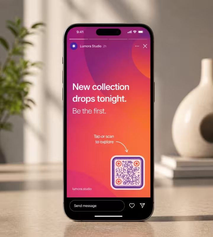
Social Campaigns and Stories
A brand-colored code on a story or end screen invites a tap-free jump to a link. Custom shapes help it stand out against busy footage without looking like spam.
How to Make a Creative QR Code
Four steps take you from raw content to a finished, tested design.
Generate QR Code- 1
Add Your Content
Enter the link, text, or details the code should open. Shorter content produces a less dense code with more room for styling.
- 2
Choose Shape and Color
Pick a module style, a frame, and colors that match your brand - keeping a clear light-versus-dark contrast throughout.
- 3
Add a Logo
Drop a logo into the center and raise error correction so the code stays readable around it.
- 4
Test, Then Export
Scan it with a couple of phones, then export as PNG for screens or SVG for print.
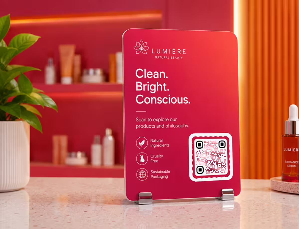
Start With a Preset or Build From Scratch
If you're new to creative codes, start from a styled preset - a circular frame or a colored module set - then swap in your link and adjust the palette. If you'd rather have full control, set the shape, modules, logo, and colors yourself and preview the scan as you go.
KoloQR lets you do both: generate a styled code in seconds, customize every part, and export print-ready vectors when you need them.
Generate QR CodeWhich File Format to Export
The right format depends on where the creative code will live. For anything printed, vector wins.
PNG
For digital use - websites, emails, social posts, and anything shown on a screen. A high-resolution export covers it.
SVG
For print and large formats, where the code scales to any size without blurring or pixelated edges. A creative code often ends up larger than a plain one.
Print-Ready Vectors
For professional production, where crisp lines and exact sizing decide whether a code scans off paper - from business-cards size to wall size.
Questions? Answered
Yes. Colors, module shapes, a frame, and a centered logo are all safe when you keep strong contrast, an intact quiet zone, and recognizable corner patterns. Problems start when styling reduces contrast or reshapes the parts a scanner depends on.
Yes. Keep the logo small - roughly the center fifth of the code - and raise the error correction level first. That redundancy lets the code reconstruct the data the logo covers. Branded QR codes covers logo size and placement in full.
The usual causes are low contrast, a missing quiet zone, over-styled corner patterns, or a logo that's too large for the error correction level. Fix those one at a time and the code typically comes back.
Low-ink patterns - dots, stars, triangles, pills - leave a gap around each module center, and a decoder handed a pixel-perfect file is stricter about that gap than a camera is. A phone's lens softens the image just enough to close it. If a checker rejects a design your phone reads, trust the phone and test the printed piece.
A clear difference between the dark pattern and the light background. High contrast - think dark navy on white rather than grey on cream - gives cameras the easiest read across lighting conditions. Colored QR codes lists the pairs that clear the bar, and the contrast checker measures yours.
Match the palette and shape to the occasion, keep the linked content short so the code stays open and easy to style, and export as SVG for print. A round frame or soft brand colors reads as intentional on invitations and signage.
Use PNG for screens and SVG for anything printed. SVG scales without blurring, so the same design stays sharp from a business card to a poster.
No. You can design a QR code with custom colors, shapes, a logo, and a circular frame, then export it for free - with print-ready vector output when you need it.
A cool QR code usually does one thing well rather than five things at once - a strong brand color, a distinctive module shape, or a frame that fits the surface it sits on. Restraint is what separates a code people photograph from one they scroll past, and it happens to be the same thing that keeps the code scannable.
Start from the palette and shape you already use elsewhere, keep the dark pattern clearly darker than the background, and leave the quiet zone alone. An aesthetic QR code is an ordinary code with disciplined styling - nothing about the grid underneath changes.
Combine two levers rather than one: a module shape plus a brand color, or a circular frame plus a centered logo. A unique QR code comes from a pairing nobody else on the shelf is using, not from stacking every effect the editor offers.
Keep Exploring
Pages that pick up where this one leaves off - the same setting, the same kind of code, or the next thing worth deciding.
QR Code Shapes
The whole shape taxonomy - modules, eyes and frames - with the trade-offs behind round, triangle, hexagon and square codes.
Colored QR Codes
Put your palette on a QR code without breaking it: which color goes on the pattern, and which belongs on the frame.
Round QR Codes
Circular modules and a round frame, for the coasters, seals, and badges a square code never sat well on.
QR Code Contrast Checker
Judge a colour pair the way a scanner does: the contrast ratio, the luminance difference a camera sees, and whether it survives print.
Why a QR Code Is Not Scanning, and How to Tell Which Fault You Have
The three ways a QR code fails - never detected, read badly, or read perfectly into a broken destination - and how the symptom tells you which one you have before you measure anything.
QR Code Finder Patterns: Why There Are Squares in the Corners of Every QR Code
What the three corner squares in a QR code actually do, why the fourth corner is empty, and how much of a symbol is structure rather than the data you put in it.
Why KoloQR?
- Create QR codes for websites, menus, Wi-Fi, PDFs, and business cards
- Customize colors, logos, and unique shapes
- Download high-quality PNG and SVG files
- Built for both print and digital